Client: Echo India, Project Echo
Art Direction: Archana Rajagopal
Illustrations: Archana, Sherina
ECHO India is the indian arm of Project ECHO - ECHO India, a not-for-profit organization working towards building capacities across areas such as healthcare, education and other sustainable development goals. The ask was to create warm, inviting illustrations that weaved a narrative of what ECHO India stands for, and the value it creates, without being too grave or monotonous.
The illustrations were to be used across the ECHO India website. We came up with stylescapes that captured this brief, and tried multiple stylistic approaches and concepts for the illustrations.
Early Stylescape Explorations
Option 1
The broad idea here is to use a simple line style with some colored elements or a color splash BG. The characters themselves would be human, but not super detailed, to keep it minimalist and fast loading. This is more direct as a style, since we’ll depict categories / professions, and showcase diversity without resorting to a lot of detailing.

Option 2
This is a more abstract style, where we can use some shapes and personify them, to keep emphasis on concepts and emotions. Characters wouldn’t be human, but can be humanoid. It adds a certain charm and sweetness to concepts, and being minimalist, it would still be fast loading. Diversity would be shown through forms and colors here. This style makes it easier to build a library of artefacts that can be reframed to suit context.

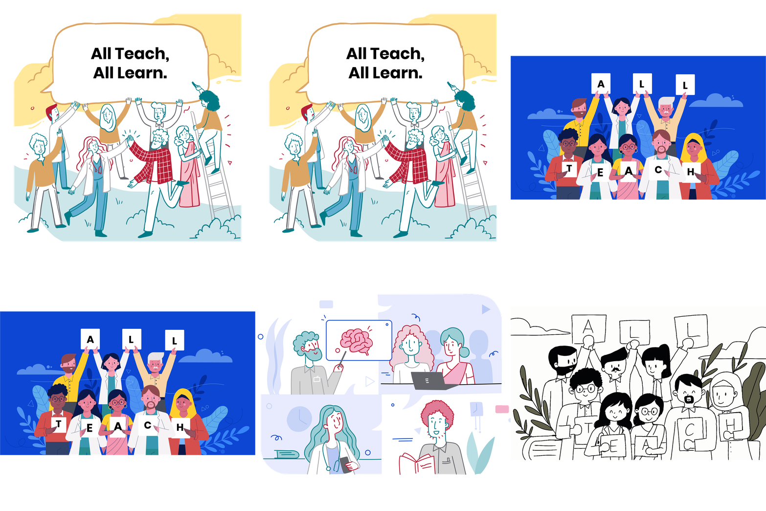
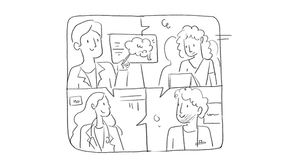
After exploring various styles we landed on this style below - attractive, clear, inclusive and warm, with a bit of fun wherever possible.
This whimsical style was used throughout their website.

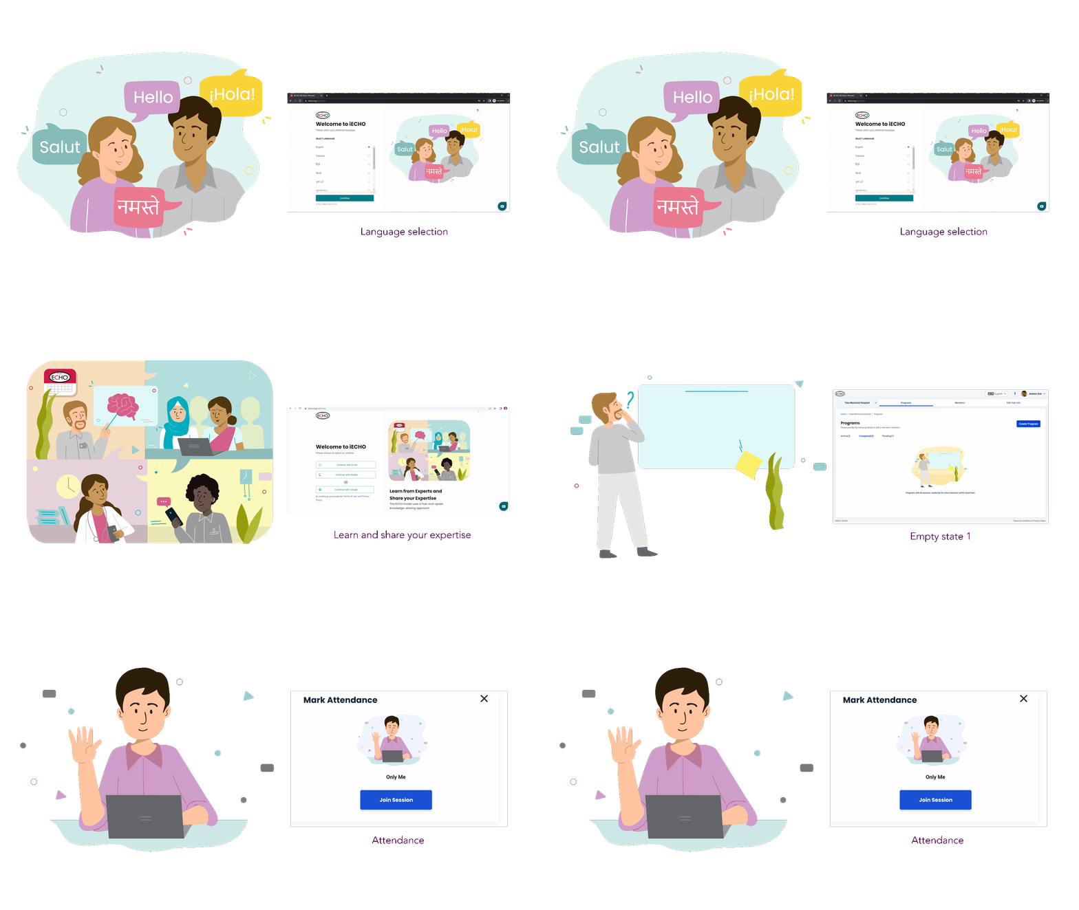
This style acted served as the base while working with Project ECHO on a set of illustrations and icons for their web based platform iECHO. Modifications were made better suit the wider audience that would use the platform. The colour palette for these was derived from the Project ECHO brand colour guidelines, and were toned down to ensure the illustrations do not upstage or distract from intended actions on the platform.
The character style is semi realistic, organic, human, and diverse.

Modifications to be made for the teaching platform:
- Work on proportions to make the figures more realistic
- Use the brand colors
- Bring in more diversity among the depicted characters.


Further explorations:
Final illustrations
Brand colors

Join session - group

Generic error

Certification - empty screen

Approval empty screen


